Using Solara for Data Science
Solara offers a few specific tutorials, including one catered towards data science. This page offers a walk-through of Solara’s example found here.
.ipynb) or Python script
(.py) file to create your appInstall Dependencies
In this data science-specific tutorial, two additional packages will
need to be installed: plotly for visualization and pandas for
data analysis.
- Built-In EnvironmentsThese two packages have been pre-installed into the built-in python-data-science environments (e.g.,
python-data-science-0.1.8). Simply ensure the appropriate kernel has been selected inside VS Code (see here). - Custom EnvironmentsIf using custom conda environments created using the instructions found here, install
plotlyandpandasusing the terminal. Packages installed into your custom environments do not need to be reinstalled with each new session.
Installation of these packages can be confirmed by navigating to the
terminal, activating the appropriate conda environment using
conda activate <your-environment-name>, and running
pip show plotly pandas.
conda activate python-data-science-0.1.8
pip show plotly pandas
A gif of the terminal output when using pip show
If using Jupyter notebook, a code cell can also be used to confirm
packages are already installed using %pip show plotly pandas.
%pip show plotly pandas
If installation is necessary, use pip install to install both
packages. This can be done inside the terminal using
pip install plotly pandas or inside a Jupyter notebook cell using
%pip install plotly pandas. When using Jupyter, ensure the kernel is
restarted after installation.
pip install plotly pandas   # use this line inside the terminal

%pip install plotly pandas  # use this inside a Jupyter notebook cell
Load Dataset
This example utilizes the canonical iris dataset.
First, import solara and plotly at the top of your script.
pandas will not need to be imported separately.
import plotly.express as px     # `import as` enables abbreviation
import solara
Next, declare any reactive and non-reactive variables. Here, we assign
the iris dataset from plotly as a non-reactive variable named
df.
df = px.data.iris()
columns = list(df.columns)
If using Jupyter notebooks, run print(columns) to see the column
variables inside the iris dataframe: sepal_length,
sepal_width, petal_length, petal_width, species, and
species_id. This line can be deleted or commented out before moving
on with the rest of the example.
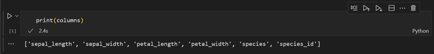
A screenshot of print(columns) output
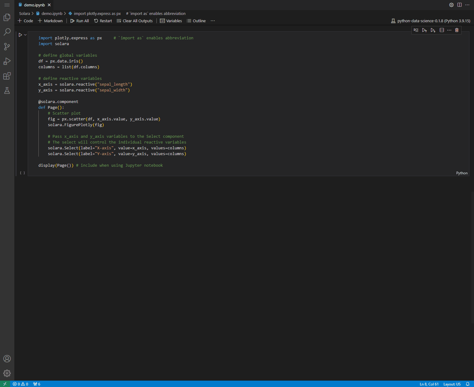
Add Reactive Variables
Next, define reactive variables. Reactive variables can be passed through Solara components for user interaction in the rendered app.
In this example, the X- and Y-axis are configured by creating a global
application state. These will be passed through a Select component
to allow the user to control which columns are used for either axis. See
more details on statement management
here.
x_axis = solara.reactive("sepal_length")
y_axis = solara.reactive("sepal_width")
Define the Main Page Component
Now, define the main Page() component. Reactive variables defined
above can be passed through, and the component will “listen” for changes
in each variable’s .value. The component will then re-execute the
defined function as with each value change.
@solara.component
def Page():
    # Scatter plot
    fig = px.scatter(df, x_axis.value, y_axis.value)
    solara.FigurePlotly(fig)

    # Pass x_axis and y_axis variables to the Select component
    # The select will control the individual reactive variables
    solara.Select(label="X-axis", value=x_axis, values=columns)
    solara.Select(label="Y-axis", value=y_axis, values=columns)

display(Page()) # use to render app inside Jupyter notebook. Unnecessary if using .py script
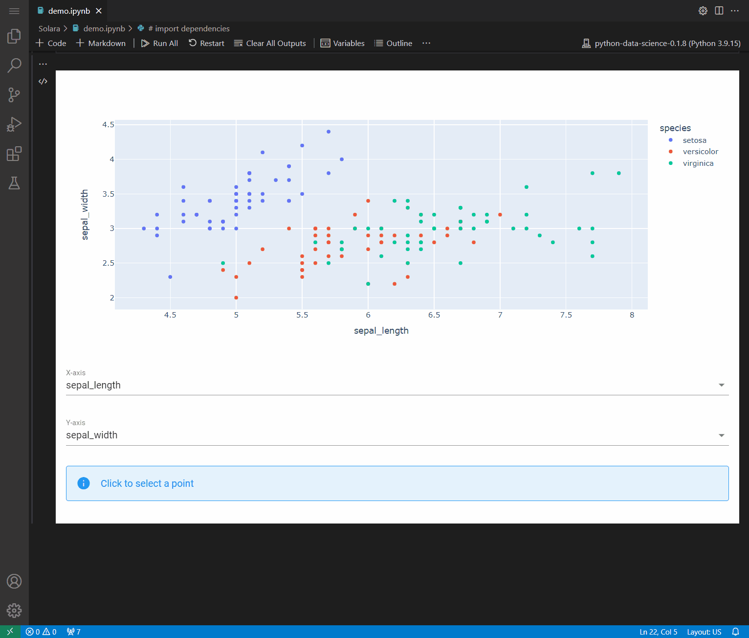
The rendered Solara app should display a scatter plot with interactive dropdown widgets to select each axis.
A gif showing the iris scatter plot output
Note: The Select components were placed below the
solara.FigurePloty() component in the code and are therefore
rendered below the plot.
Enable Data Interaction
Now that we’re able to display a simple scatter plot of our data, we want to add additional functionality to the app to improve our ability to interact with the data.
One method to extract data from the scatter plot is to store selected
data into a new reactive variable. Selected data is retrieved by
on_click and stored into click_data. This information can be
displayed into a Markdown component inside the main Page()
component.
To do so, add the following line of code to the section where other reactive variables are defined.
click_data = solara.reactive(None)
We also want to add an indicator (e.g., ⭐️) that highlights the data
point clicked inside the scatter plot. Use an if statement to
determine if a data point has been clicked and, if so, to add the
indicator. Code is shown below:
if click_data.value is not None:
        x = click_data.value["points"]["xs"][0]
        y = click_data.value["points"]["ys"][0]

        # add click indicator
        fig.add_trace(px.scatter(x=[x], y=[y], text=["⭐️"]).data[0])
Place the previous line of code inside the Page() definition. The
Page() component should now appear:
@solara.component
def Page():
    fig = px.scatter(df, x_axis.value, y_axis.value)
    solara.FigurePlotly(fig, on_click=click_data.set)

    # UI selection widgets
    solara.Select(label="X-axis", value=x_axis, values=columns)
    solara.Select(label="Y-axis", value=y_axis, values=columns)

    # store click data
    if click_data.value is not None:
        x = click_data.value["points"]["xs"][0]
        y = click_data.value["points"]["ys"][0]

        # add click indicator
        fig.add_trace(px.scatter(x=[x], y=[y], text=["⭐️"]).data[0])
Additionally, we want to define a function to show the closest neighbors
of the data point clicked. Add the following code after the section
where reactive variables are defined, but before Page() is defined.
This function will return nearest n neighbors specified (i.e., see
n=10 in the topmost line below).
def find_nearest_neighbours(df, xcol, ycol, x, y, n=10):
    df = df.copy()
    df["distance"] = ((df[xcol] - x)**2 + (df[ycol] - y)**2)**0.5
    return df.sort_values('distance')[1:n+1]
To use this function, we can utilize the following code with n=3.
This will return the top 3 neighbors if a data point is clicked, or
otherwise none.
if click_data.value is not None:
    df_nearest = find_nearest_neighbours(df, x_axis.value, y_axis.value, x, y, n=3)
else:
    df_nearest = None
The previous lines of code can be combined with the others inside the
click_data.value’s if statement as shown below:
if click_data.value is not None:
        x = click_data.value["points"]["xs"][0]
        y = click_data.value["points"]["ys"][0]

        # add an indicator
        fig.add_trace(px.scatter(x=[x], y=[y], text=["⭐️"]).data[0])

        # find nearest n=3 neighbors
        df_nearest = find_nearest_neighbours(df, x_axis.value, y_axis.value, x, y, n=3)
    else:
        df_nearest = None
We also want to display these neighbors on the app. The following lines
of code can be added at the end of the Page() component.
if df_nearest is not None:
        solara.Markdown("## Nearest 3 neighbours")
        solara.DataFrame(df_nearest)
    else:
        solara.Info("Click to select a point")
Execute Combined Code
The app’s full code should now appear similarly to that shown below.
Note the inclusion of two additional arguments inside px.scatter():
color="species" to use species for coloring and
custom_data=[df.index] to use index values to extract data for use
in widgets. custom_data is not user-visible and is included in the
figure’s events (e.g., data selection). Additional details can be found
here.
# import dependencies
import plotly.express as px     # `import as` enables abbreviation
import solara

# define global variables
df = px.data.iris()
columns = list(df.columns)

# define reactive variables
x_axis = solara.reactive("sepal_length")
y_axis = solara.reactive("sepal_width")
click_data = solara.reactive(None)

# define function to find nearest neighboring data points
def find_nearest_neighbours(df, xcol, ycol, x, y, n=10):
    df = df.copy()
    df["distance"] = ((df[xcol] - x)**2 + (df[ycol] - y)**2)**0.5
    return df.sort_values('distance')[1:n+1]

# define app's main component
@solara.component
def Page():
    # add scatter plot using plotly express
    fig = px.scatter(df, x_axis.value, y_axis.value, color="species", custom_data=[df.index])

    # store click data
    if click_data.value is not None:
        x = click_data.value["points"]["xs"][0]
        y = click_data.value["points"]["ys"][0]

        # add a star indicator upon clicking data point
        fig.add_trace(px.scatter(x=[x], y=[y], text=["⭐️"]).data[0])

        # reactively obtain nearest neighbors upon clicking data point
        df_nearest = find_nearest_neighbours(df, x_axis.value, y_axis.value, x, y, n=3)
    else:
        df_nearest = None

    # plot figure
    solara.FigurePlotly(fig, on_click=click_data.set)

    # enable UI dropdown widget to select axis categories
    solara.Select(label="X-axis", value=x_axis, values=columns)
    solara.Select(label="Y-axis", value=y_axis, values=columns)

    # show dataframe of the clicked point's nearest n neighbors
    if df_nearest is not None:
        solara.Markdown("## Nearest 3 neighbours")
        solara.DataFrame(df_nearest)
    else:
        solara.Info("Click to select a point")

# display app inside Jupyter notebook (not needed if using .py script)
display(Page())
A gif demoing the data science example